CSS Media Queries Advanced
We’ve discussed Media Queries briefly in this tutorial: CSS Media queries. Let’s now try to understand them in detail.
Media queries are used when we want to customize our website's presentation according to the user's screen size. With the help of media queries, user can display different markups based upon the device's general type(mobile, desktop, tablet).
It is a logical operation. Whenever a media query becomes true, then the related CSS is applied to the target element.
Syntax: @media media-type and (media-feature)
@media signifies the start of a media query, the type property defines the display screen on which the rules are to be applied like phone, tablet, pc, etc.
Media-feature tells about the dimensions of the screen.
Eg:

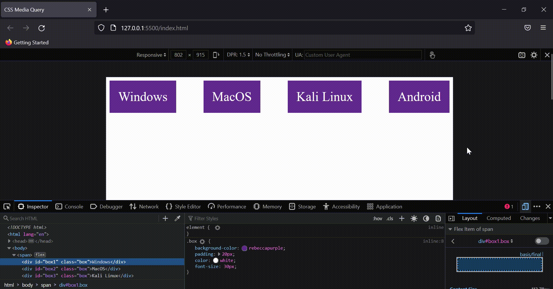
We’ve create here 4 boxes wrapped up in the span. Now let’s write rules for the same.
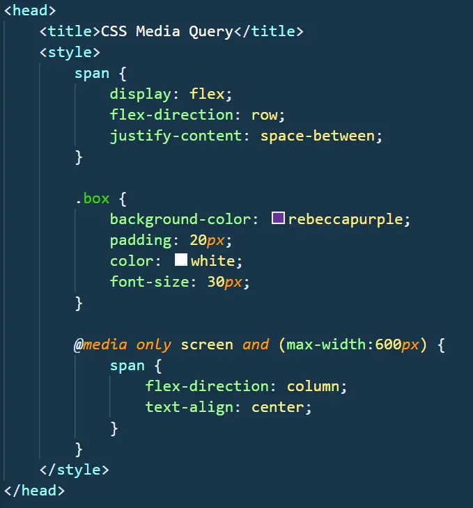
We’ve created a flexbox with direction as a row, but as soon as the width reaches 600px the direction of the flex changes to the column, and the text gets aligned at the centre.
Output: