CSS 2D Transform
CSS 2D Transform
This property allows the content to be restructured in ways like translate, rotate, scale or skew, etc.
As it is 2D, therefore the content is transformed into x and y dimensions.
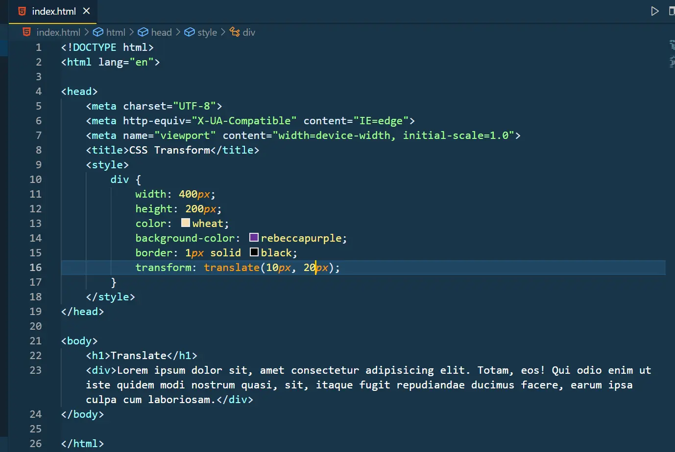
Translate
This property transforms the element’s position along x or y or both x and y directions.
Eg:
Output:
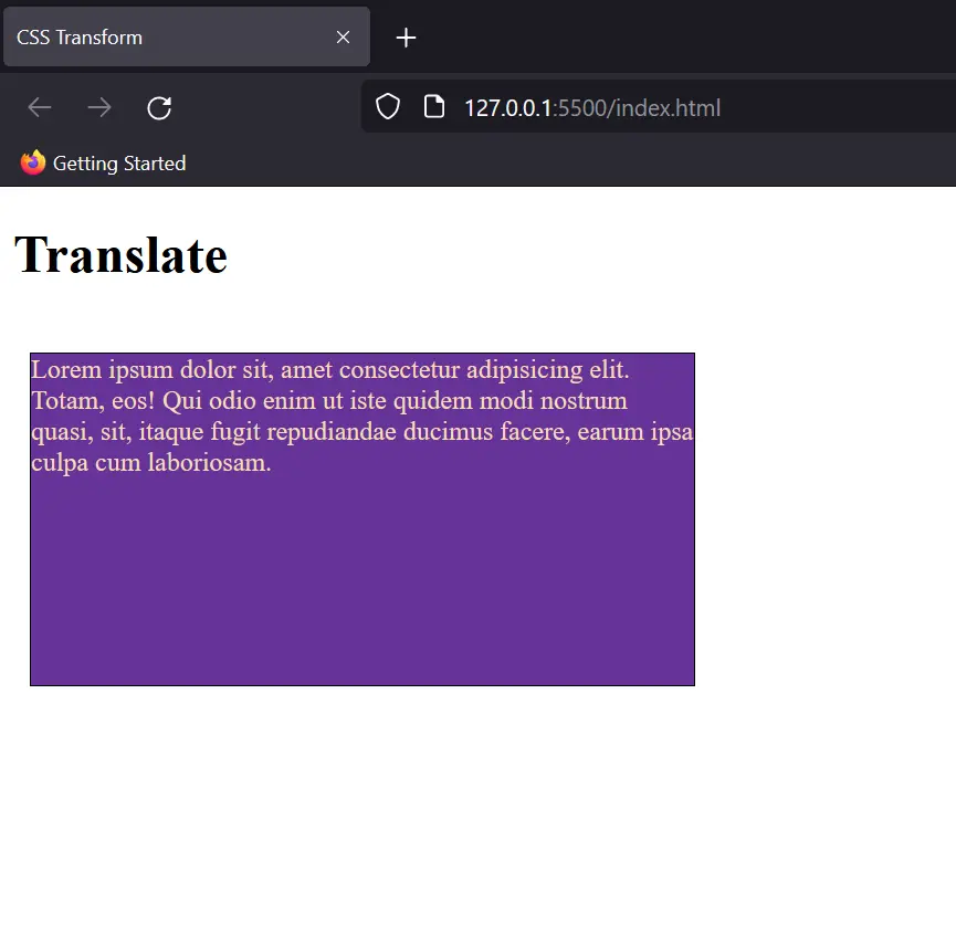
Rotate
This property rotates the content of the division either anticlockwise or clockwise acc to the degree of rotation. The values are taken in degree and on adding a negative sign the rotation becomes anticlockwise.
Syntax: transform: rotate(value);
Eg:
Output:
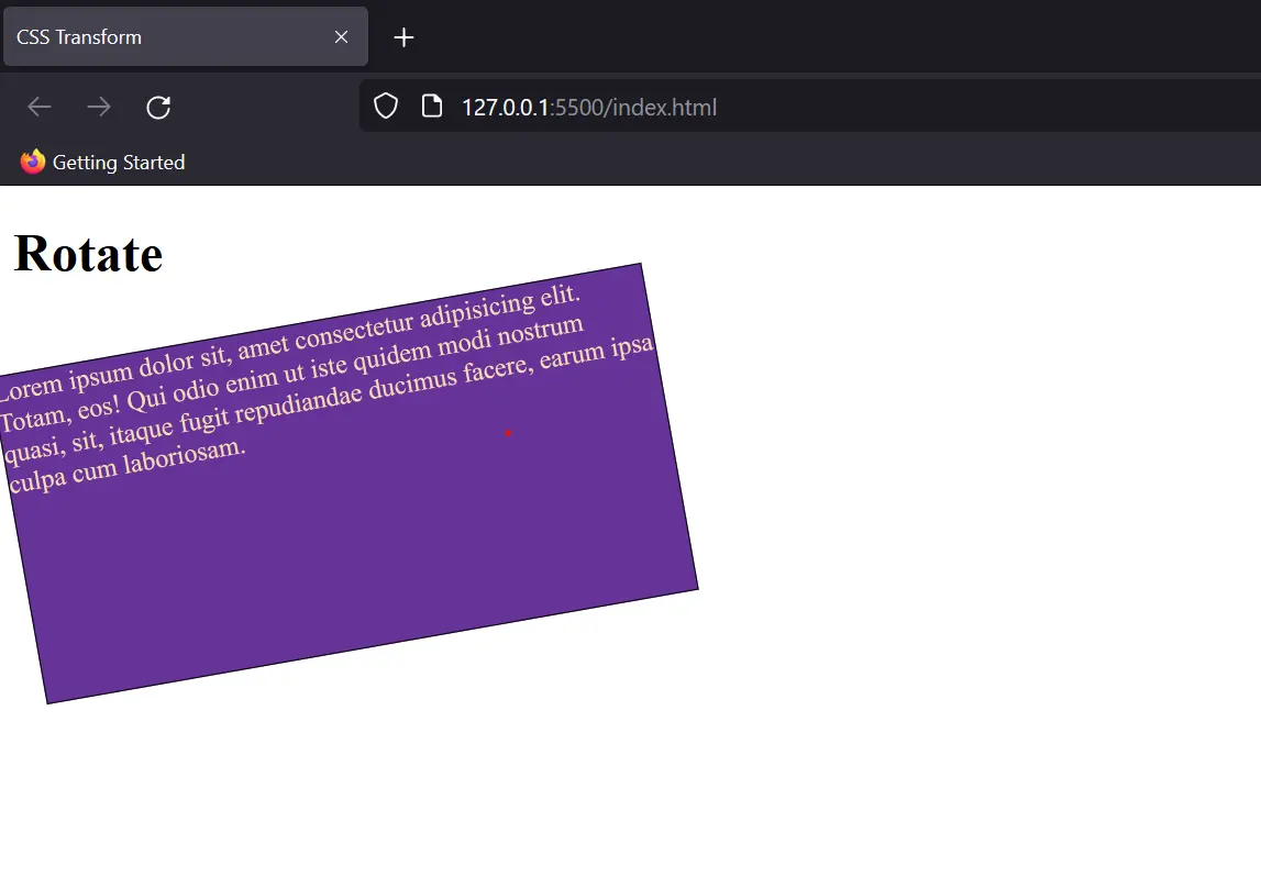
Scale
This property rescales the width and height of the division in the ratio to the original dimensions.
For eg:
This code will increase the width and height by 1.4 and 1.2 times the original respectively.
Output:
Note: This property also changes the aspect ratio of the div, so has to be used accordingly.
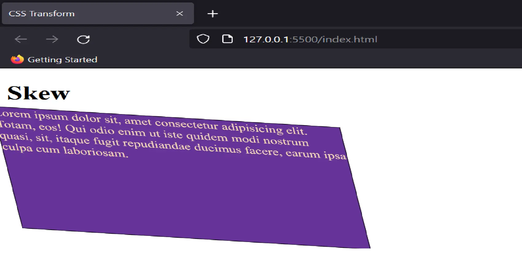
Skew
This property helps in adding a slant or skew to division. (Skew: A pair of lines neither intersecting nor parallel)
Eg:
Output:
You can also choose to give the values for skew in a particular axis by adding a postfix with skew: skewX.
Note: The properties for 3D Transform are also identical; a new dimension z is included into it.