CSS Gradients
CSS provides the styling of background colour with gradients. You can blend as many colours to create gradients.
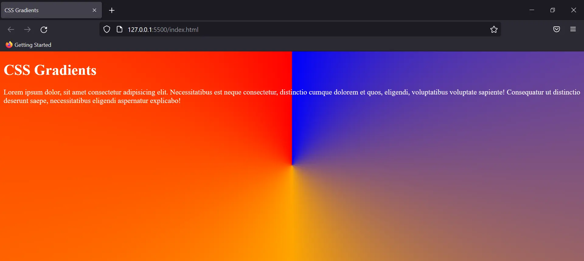
Linear Gradient
The gradient goes from top to bottom, and from left to right. To implement this gradient you need at least two colour stops. (could be more too)
Eg:
Output:
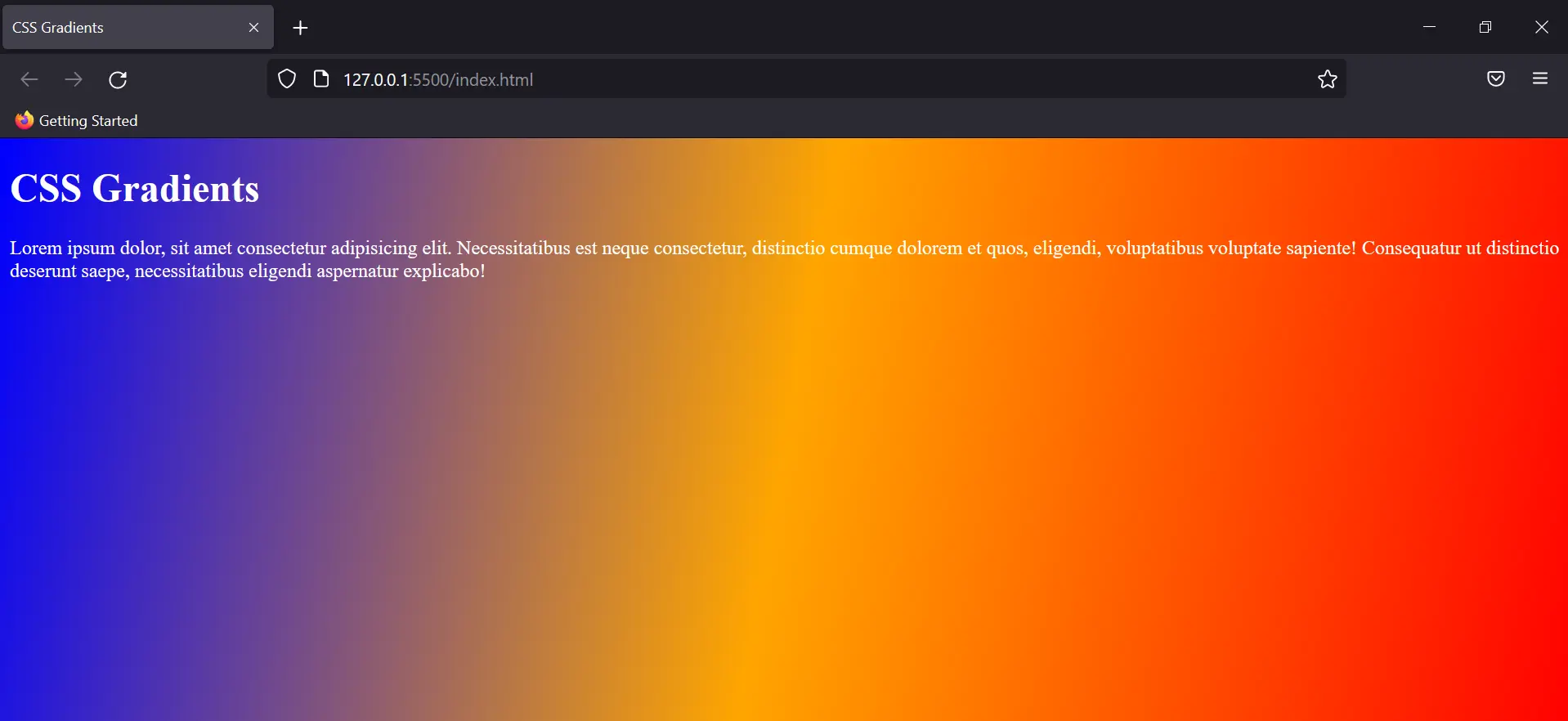
The degree controls the angle of the gradient, and by using comma-separated values you can add multiple colours for the background.
Note: You can also use repeating-linear-gradient to keep repeating the background for the whole screen.
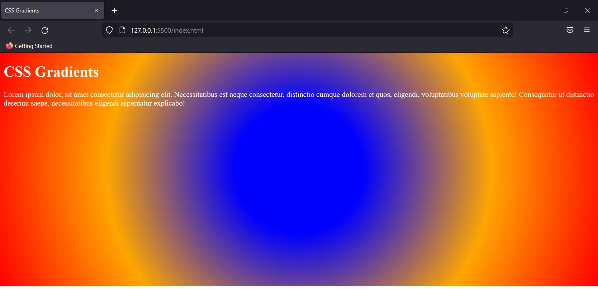
Radial Gradient
The gradient here is added from the centre focal point. The colour added first marks the centre of the gradient and keeps expanding circularly.
Eg:
Output:
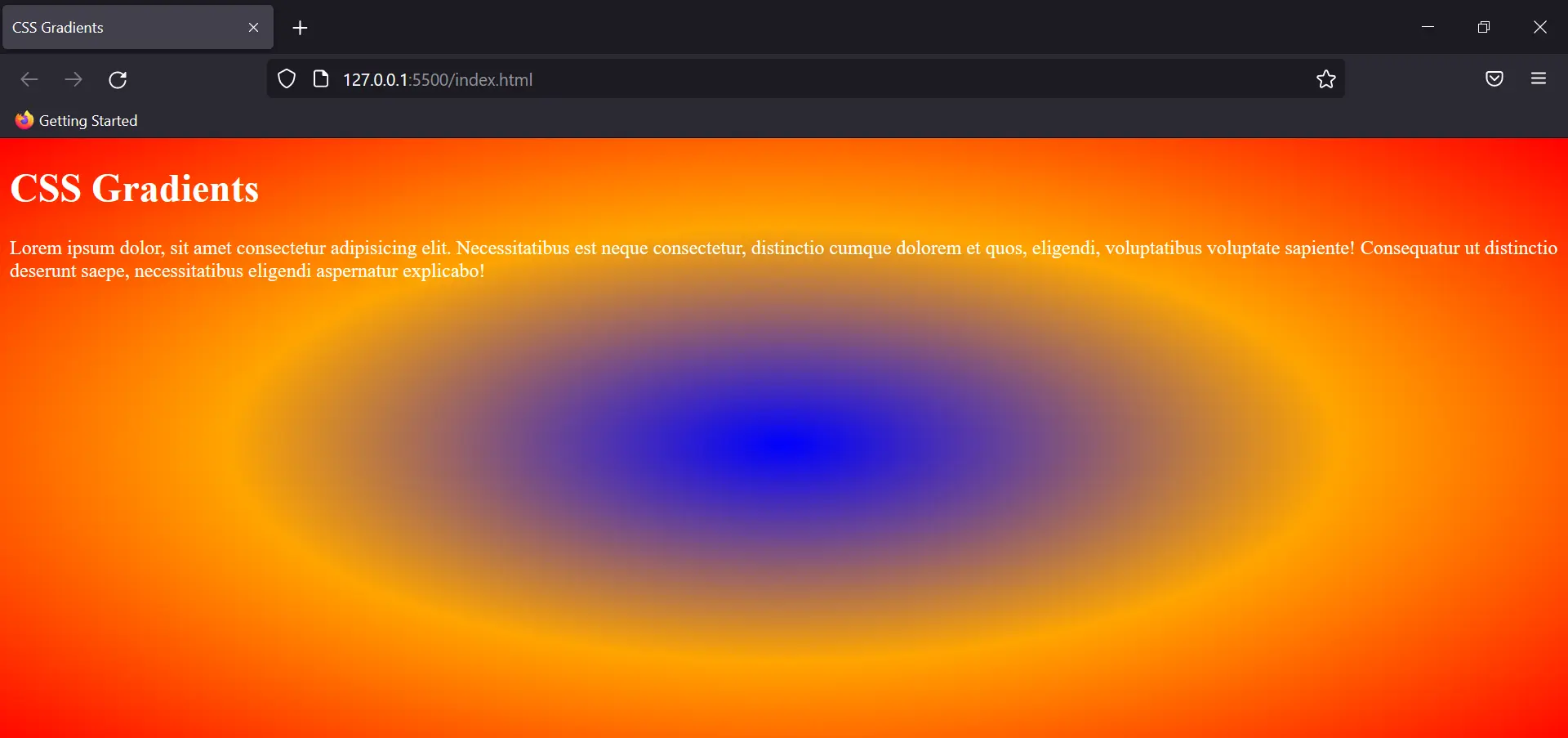
This is the default output but you can regulate the amount of each colour by adding a percentage with the colours, like radial-gradient(blue 20%, orange, red);
The default shape of the gradient is an ellipse, but you can set it to circle too. Just add a circle ahead of the colours, separated by a comma.
Output:
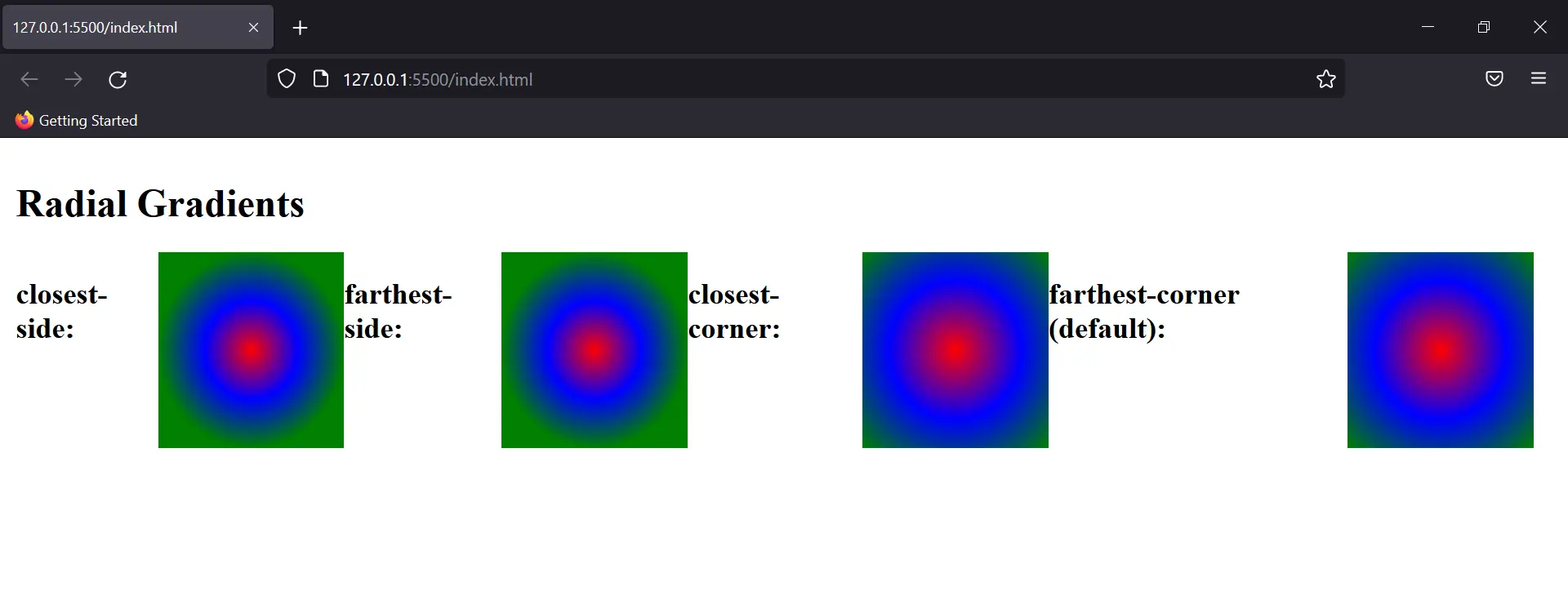
To use different sizes of the gradient we use the following properties:
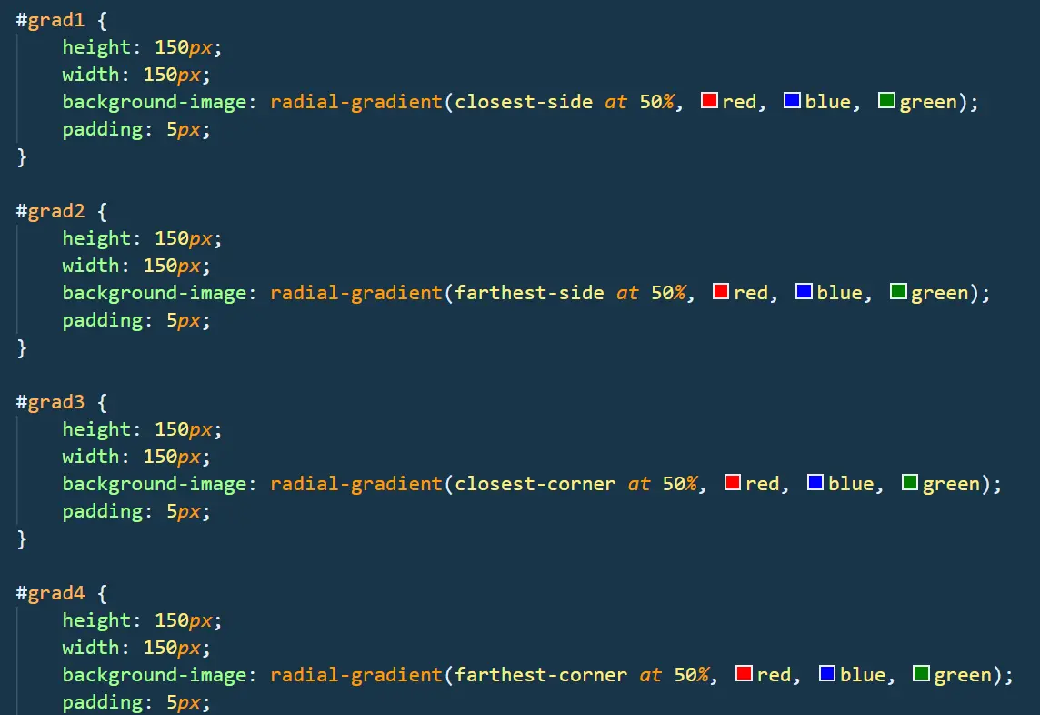
Output:
Conic Gradient
The colour gradient rotates around a specific point in the form of a cone. By default, the degree of the cone is taken as zero and starts from the centre.
Eg:
Output: