CSS Animations
CSS Animations help to animate elements from one frame to another. Controlling various CSS properties helps in changing the animation style and time without having the need to use JavaScript for the same.
The most basic way to do so is by using “from” and “to”.
Eg:
The animation here would start with the background colour as red and will turn blue gradually. To use this animation we simply add it to the div stylesheet rule.
This is the most basic way to do CSS animations, but now let’s look into the properties for advanced animation styling.
1. Animation Name
To identify the animation we assign it with the name. In the above example the name was demo. So, we will add the attribute animation name in the div element.
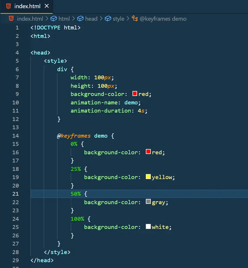
2. Key Frames
Keyframes define at what % of the animation, which stylesheet rules should be used. The value of keyframes varies from 0% to 100%.
To add keyframes use the % operator with the value inside the keyframes. More keyframes mean smoother animation.
Eg:
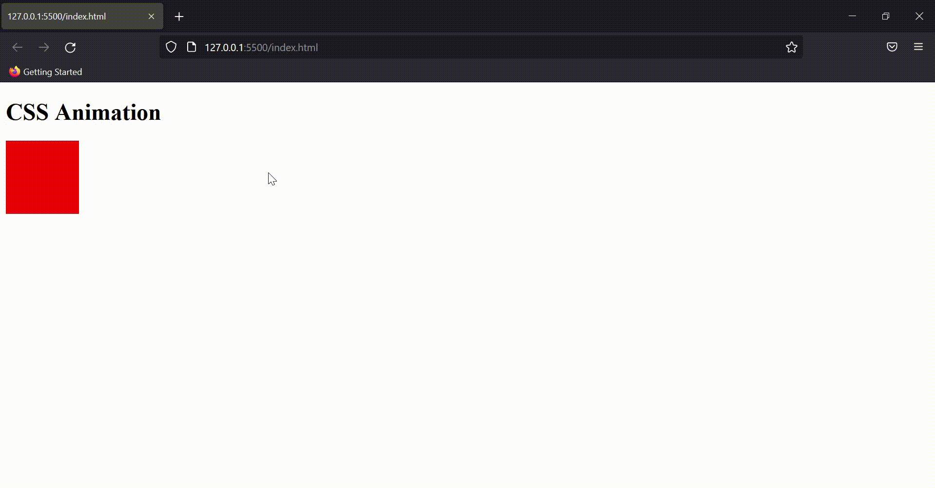
Output:
3. Looping Animations
By default the animation runs only one time on the website but you can choose to loop the animation by using the “animation-iteration-count” property.
Just assign the values to the property and the number of times the animation will run.
To keep the animation running continuously we keep the value as “infinite”.
4. Animation Durations
Animation Duration is the key property to start the animations. By default, the animation duration is 0 sec, which means the animation won’t start.
So, to start the animation we will assign the value to the animation duration.
5. Other Properties
Animation Delay
Delays the start of animation on the website. Adding a negative value to delay will make the animation run even before the website is loaded.
Eg:
Animation Direction
This property defines the order of the animation. Whether it should be played forward, reverse or alternatively. The values it takes is:
- normal: the default state of forward animation.
- reverse: plays the animation in the reverse direction.
- alternate: forward animation and then backward.
- alternate-reverse: reverse animation and then forward.
Animation Timing Function
It defines the speed curve for the animation. This property adds ease to our animation and can have the following values: ease, linear, ease-in, ease-out, and ease-in-out.
As the properties are self-explanatory, you can see the output accordingly.
Animation Fill Mode
This property defines the style of the element when the animation is either stopped or about to start. The value it takes is none(default state), forwards(value set by the last keyframe), backwards(value of the first keyframe) or both.
Animation ShortHand
We’ve seen shorthand properties for other CSS properties and the same can be applied to Animation too.
Eg:
Output: