
CSS FlexBox
FlexBox aka Flexible Box Layout makes it easier to layout, align and style items in the container while maintaining the responsiveness of the website.
To create a flexbox you need to set the display of the container as flex
Eg: {display: flex;}
This element is called the flex container, and stores the sub-elements which are known as flex items
Flex Container Properties
The flex container properties are:
1. Flex Direction
It defines in which direction the flex elements would be displayed. It takes values like row, column or “reverse” too.
Eg:
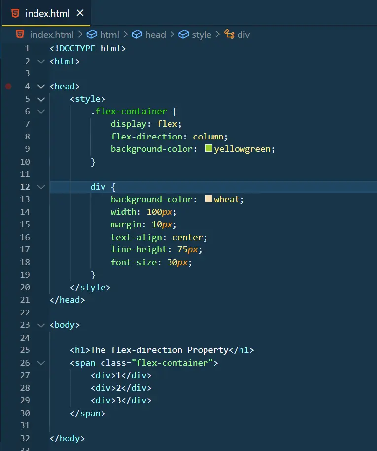
Output:
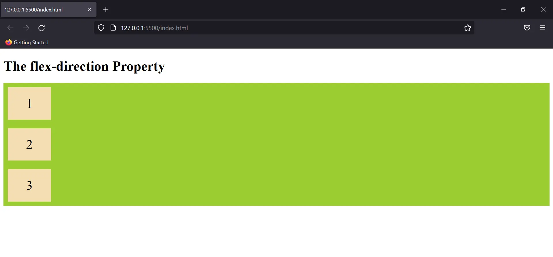
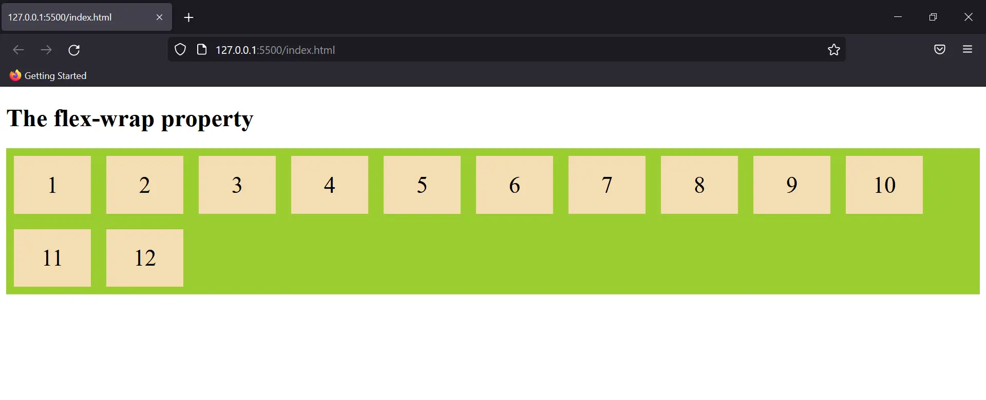
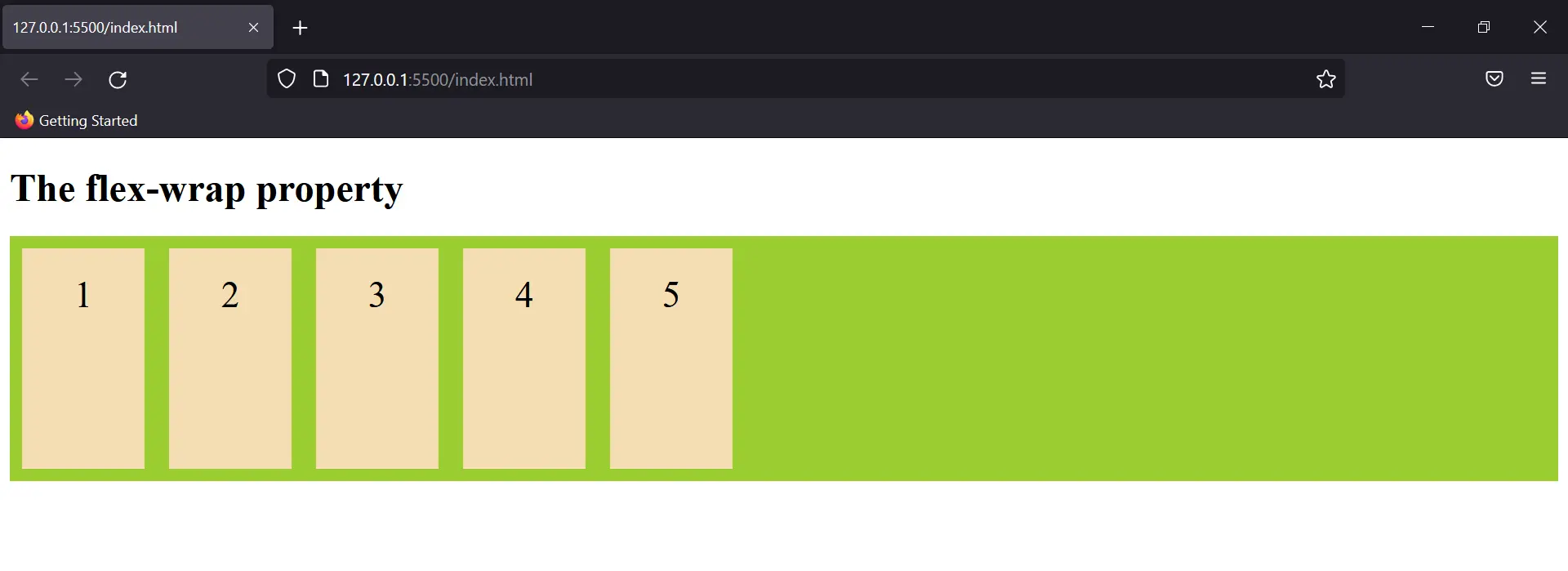
2. Flex Wrap
By using this property we can make our elements responsive for different screen sizes.
Eg:
Output:
You can use flex flow as a short to add both these properties. Eg: {flex-flow: row wrap;}
3. Justify Content
This property is used to set the position of content or rather align content along the main axis.
Eg:
Output:
It can take other values too like “space-around” which distributes flex items equally spaced in the container. Other properties include flex-end, flex-start, space-between, etc. (These could be seen in vs code when the justify-content property is selected).
4. Align Items
Just like the justify-content property, align-items define the alignment of the flex container but along the cross-axis.
Eg:
Output:

5. Align Content
This property is very similar to align item but here rather than the flex items, the content present in the item is selected for the property.
Eg:
Output:
Flex Items Properties
The flex item properties are:
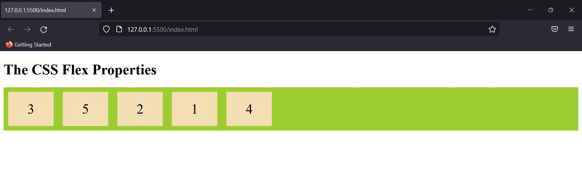
1. Order:
As the name suggests, this property sets the order in which the flex items are shown.
Eg:
Output:
2. Flex Grow & Shrink
Decides the relative size of flex items. By default, this property is zero and thus items have the same size.
Eg:
Output:
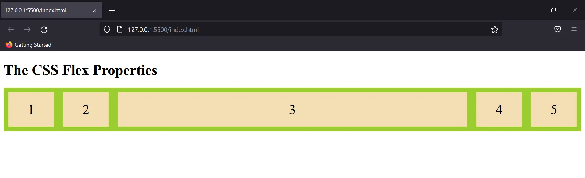
We can also use flex-shrink to decrease size of an element.
3. Align Self
This property allows default alignment to be overridden for the individual flex items. Try adding inline CSS to see how this property is used.
