CSS Grid
CSS Grid
Just like FlexBox, CSS Grid with the use of rows and columns, make it easier to style website elements.
CSS display property allows two grid properties: Grid and Inline Grid. The elements placed in the grid container are called grid items.
Most of the properties of Grid are similar to FlexBox.
Let’s look at how you can create a grid in CSS.
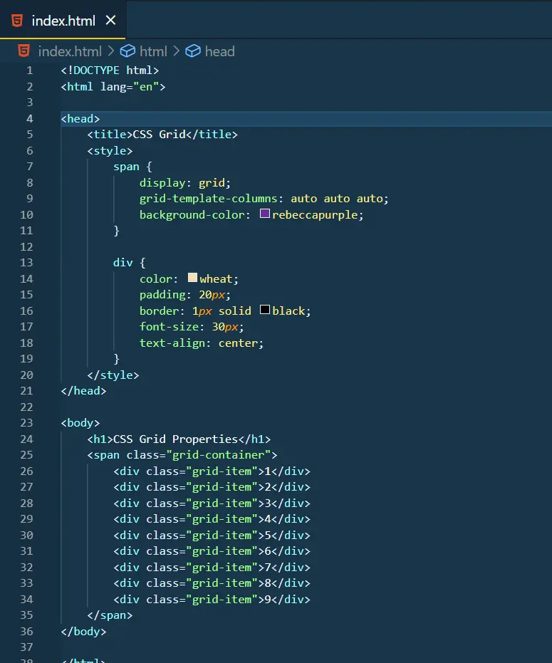
Output:
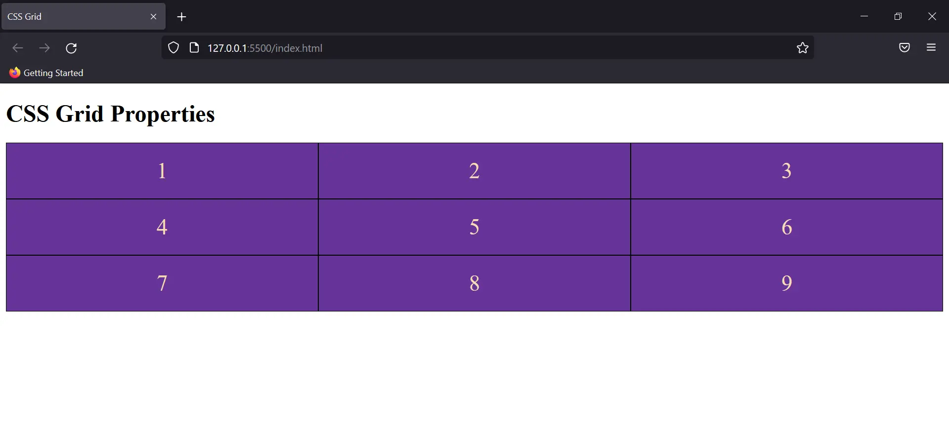
Grid Row & Column Property
This is just adjacent to the flex-grow property in Flex Box. It decides how many columns would the selected element be taking in the Grid.
Eg:
Output:
This way you can style Grid dimensions to create Header, Footer, and other structures of your website.